If you’ve been reading this blog for any length of time, you’ll know that maps and history are two of my favorite things. I love history because I love learning about the vast panoply of the human experience, the millions of twisting threads of time that created the world we live in today. And I love maps because I don’t think you can really understand the world without being able to picture it. Maps are such amazing tools, laying out in detail how the world functions, its geography and politics and topography, and the ways in which those change over time. It probably won’t surprise you, then, to know that I like historical maps quite a lot. Learning about how someone chooses to depict the world can tell you quite a lot about their point of view, and seeing the way in which people in different times make different choices about how and what to illustrate can show you how our perception of the world has changed. That’s what we’re going to do today. I have here a small collection of historical maps that I think are really cool. I’ve done something similar in the past for World War I, and now I’m continuing my cartographic voyage through the rest of time and space. There’s no real rhyme or reason behind the choices for inclusion beyond that I want to share them with you and talk about them and hopefully learn together something about our history. So, without further ado:
Previous Installments: WWI, Part One, Part Two

Between 1870 and 1902, virtually the entire African continent was carved up and colonized by European powers, in the so-called “Scramble for Africa“. Between 1950 and 1970, virtually all of those empires disintegrated, often overnight. There had been, following World War II, a widespread understanding that things could not continue as they had before, but few predicted just how precipitously the Imperial system would collapse. This map of “African – 2000 AD”, dated to 1963, at the height of decolonization, is a fascinating snapshot of the ways in which people are unable to predict events, even while they are occurring. The prediction that Portugal would retain its colonies, for example, seems almost random, until one remembers that the Estado Novo regime waged a colonial war from 1961 to 1974 to hold onto their colonies, long after most of their contemporaries had given up. To Lisbon, the colonies were Portugal, indivisible, and no surrender could be contemplated. Likewise, British East Africa being labeled “Full Governing Members” of the Commonwealth is a good reminder that the British initially hoped to convert their Empire into a federation of equal states, bound together in permanent alliance. That dream was already dying by the mid-1960s, but not everyone realized it yet. Most intriguing is the United States of Africa. Various proposals for pan-African projects have been floating around for decades, but I am fascinated by the choice of borders here, which seems based off of the French Colonial Empire in Africa, but also includes Nigeria and other British colonies in West Africa. Is there some relation to the French Community, which had just fallen apart in 1963? I wish I knew what the logic was, but I cannot find any source as to who actually created this map.
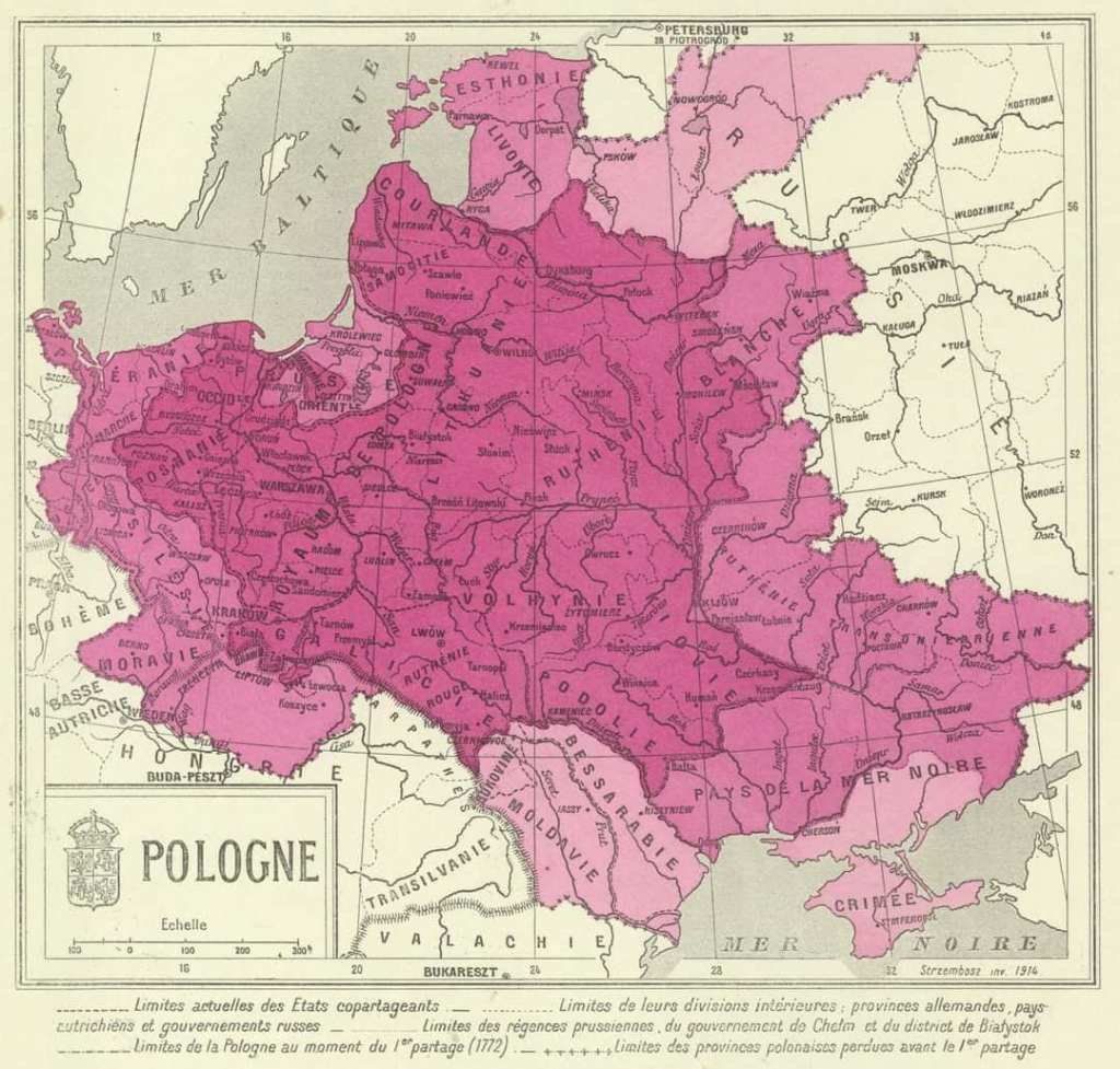
In the 16th and 17th centuries, the Polish-Lithuanian Commonwealth was one of the preeminent Great Powers of Europe. By the dawn of the 19th, it had vanished from the map, partitioned and annexed by Russia, Prussia, and Austria. This map dates to 1915, and was created by Władysław Alojzy Strzembosz, a Polish librarian and intellectual. It was published by the Polish Library in Paris, a center of Polish intellectual culture in exile, founded in 1838, after the failure of the November Revolt. This is, then, not merely an interesting artifact of history, but an active act of remembrance, an attempt to keep alive the memory of what once had been–undermined, perhaps, by the very fact that it is labeled in French. That it was published in 1915 is also noteworthy, given how many Poles hoped that the First World War would result in the reemergence of an independent Poland, a hope that would be fulfilled in 1918. Perhaps also relating to that purpose is the fact that this map seems to vastly overestimate how much territory Poland controlled, even at its height. One cannot help but wonder if there’s a connection to Józef Piłsudski’s proposal for an Intermarium.
That’s what I love about propaganda maps. They don’t just tell you about the world that is, they tell you about the world that could be, or that somebody wishes to make.

There was something in the air in the 1920s. The First World War had shattered all the old certainties of the dynastic order, and nobody really knew for sure what was going to replace it. Communism? Fascism? Liberalism? Or something even stranger? There was a positive flood of utopian proposals for re-ordering the Earth, plans and schemes and strategems trying to build something new atop the rubble, such as the (in)famous Atlantropa proposal. And today, we see another: Das Neue Europa Mit Dem Dauernden Frieden. Die Unionisierung Mitteleuropas. (“The New Europe with Lasting Peace. The Unionization of Middle Europe.”) Though it was published anonymously in 1920, the author has since been identified as P.A. Maas, the son of a Viennese printer who seems to be known for literally nothing else.
Maas looked for a solution to the bloody crisis of nationalism, and found it, like so many others would, in European Unity. But he went further then his successors would. In his proposed European Union, the entirety of Central and Western Europe would be carved up into equal cantons, superseding and eliminating traditional boundaries, all terminating at the new capital city of Vienna (to be renamed “Sankt Stephan”). People would be divided into four Nations–Romans, Germans, Slavs, Magyars–and each Canton would include representatives from at least two. The national language would be Esperanto, and the Union would be a democracy, governed by universal suffrage. To those concerned about the consequences of this program, Maas assured them:
In my project, the national states are surely torn apart, but they are, as it were, brought under one roof by creating sub-regions in which all nations are fused by or with time, a new human nature emerges from all the good and noble sides of every present nation, in which racial hatred does not prevail as before, but the love of the people prevails, and thus bestows happiness and blessings on all those who are counted as a unitary nation.
(Source)
This was, of course, not a serious proposal in any sense. But it’s a fascinating look at the zeitgeist of those tumultuous interwar decades, when nobody really knew for sure what was going to happen next, and anything seemed possible.

The Pan-American Highway is a network of paved roads, built piecemeal over the course of the early 20th century, that tie together Canada, the United States, and most of Central and South America. Only the Darién Gap remains unbridged. This 1946 State Department map, showing both completed and planned segments, provides a view of the Americas that we don’t usually see, focusing not on geography or politics, but on this monumental infrastructure project tying the two continents together. It strikes me as symbolic of the post-WWII era, both in terms of of American ambition and global hegemony, and in regards to the scale of technological and economic advancement. A series of paved roads 19,000 miles long, suitable for automobiles, is something that could or would only be built in the modern world. Power comes in all shapes and sizes, and sometimes it’s not just about readjusting the lines on a map, it’s about devising new ways to map the world.

In 1914, the world order began to fall. After a century of mediated peace, the Great Powers of Europe once again began an apocalyptic clash for dominance, and like the last time this had occurred, it would change the shape of global politics forever. This map, published by The Daily Mail in 1914, shortly after the beginning of the war, presents an interesting and contemporaneous view of the battle lines, both literal and metaphorical. We’re used to seeing the First World War in hindsight, and in context, usually in relation to the Second World War that began twenty years later. But this map shows how they saw it unfolding as it began. The purpose of this map was not purely educational, it was published by The Daily Mail to encourage recruitment into the British Army, hence the emphasis on England’s small professional force. But it’s fascinating to see the statistics here; the carefully enumerated lists of troops, ships, planes, monies, forts, etc, from the perspective of people who did not know that the Allies would end up outnumbering and outspending the Central Powers by several orders of magnitude.
Similarly, Italy here is shown as aligned with Germany and Austria, due to the pre-war defensive agreement of the Triple Alliance. They did not know, of course, that Italy would declare war on her former allies in May, 1915. Belgium and Serbia are left out of the Allied side of the ledger, which I suspect is a sign of contempt. Nobody then realized that Serbia would resist the Austro-Hungarian invasion successfully until Bulgaria joined the war in October, 1915. Spain and Portugal are both depicted here as being aligned with the Allies; Portugal would eventually enter the war in 1916, but Spain remained neutral throughout.
History always looks different when you’re inside of it.

The 1856 presidential election was an earthquake in American politics, though people may not have realized it at the time. Democrat James Buchanan won a comfortable victory to replace fellow Democrat Franklin Pierce, continuing his policies of appeasing the pro-slavery South. But though John C. Frémont went down to defeat, his strong showing was a sign of things to come. The Whig Party, long the main opponent of the Democrats, had collapsed after the 1852 election, unable to consolidate around a position on slavery. There was a new party now, the Republicans, uniting the Old Whigs, the Free Soil Party, anti-slavery Democrats, and a host of other factions. They would lose in 1856, but in 1860, their nominee Abraham Lincoln would cinch the victory, demonstrating that a strong anti-slavery majority existed. The South would respond with secession, and Lincoln would respond with war.
That was all still in the future in 1856, but it was not hard to predict. This map, published by supporters of the Frémont campaign, lays out the stakes with admirable clarity. At issue was the expansion of slavery into the Western Territories, which Congress had been agonizing over for decades at this point. Here, we can see the contemporary balance of power, in congressional delegations, in presidential electors, in states, and the ways in which the collapse of the Missouri Compromise had the potential to shift everything.
If our last map showed how hard it can be to understand history while you’re still inside it, this one shows that sometimes, it can be glimpsed with dreadful clarity. The Crisis of the 1950s, culminating in the Civil War, becomes almost inevitable. Slave States had enjoyed a de facto veto power over federal policy for decades, able to ensure a disproportionate voice in Washington D.C. due to the infamous Three-fifths compromise. Population growth in the North was changing that, and the fate of the Western Territories was now the key. If Slave Power took them, it could extend its reign for decades. If not, it was doomed to be outnumbered and outvoted.
Four years later, that prophecy would come true, and the Southern slave-owners would try and drown the Republic in blood, rather than face that inevitable slow, grinding defeat.

Those are some great maps – and insightful commentary on them! I particularly like how the Pan American Highway one is split into several segments to fit neatly, and how the US is not depicted on the map (but of course implied).
LikeLike