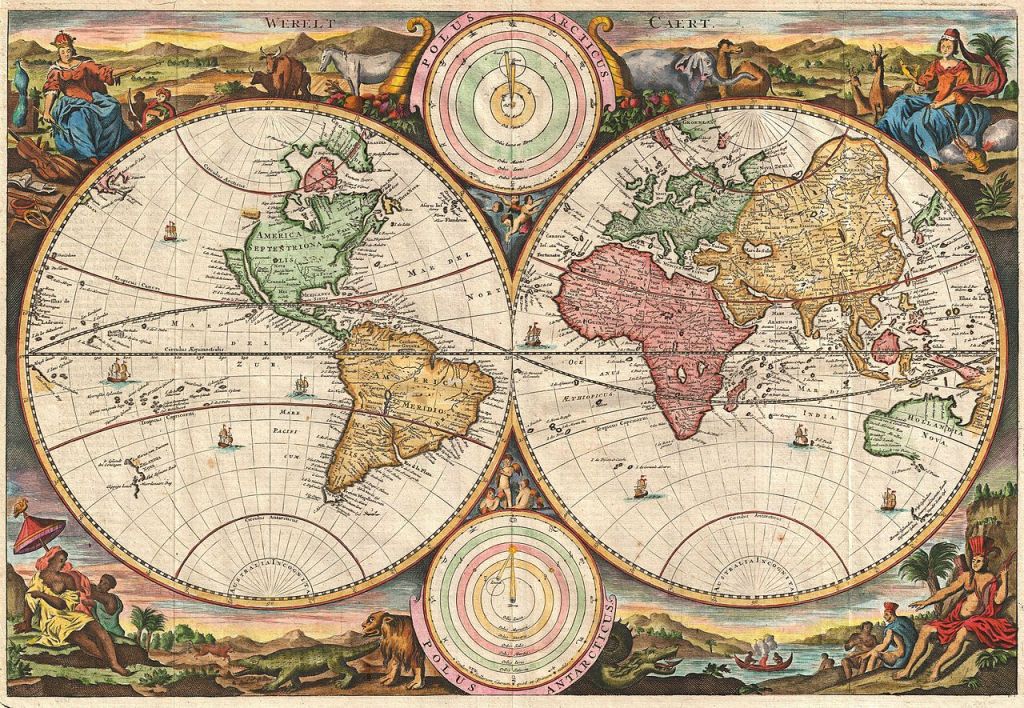
If you’ve been reading this blog for any length of time, you’ll know that maps and history are two of my favorite things. I love history because I love learning about the vast panoply of the human experience, the millions of twisting threads of time that created the world we live in today. And I love maps because I don’t think you can really understand the world without being able to picture it. Maps are such amazing tools, laying out in detail how the world functions, its geography and politics and topography, and the ways in which those change over time. It probably won’t surprise you, then, to know that I like historical maps quite a lot. Learning about how someone chooses to depict the world can tell you quite a lot about their point of view, and seeing the way in which people in different times make different choices about how and what to illustrate can show you how our perception of the world has changed. That’s what we’re going to do today. I have here a small collection of historical maps that I think are really cool. I’ve done something similar in the past for World War I, and now I’m continuing my cartographic voyage through the rest of time and space. There’s no real rhyme or reason behind the choices for inclusion beyond that I want to share them with you and talk about them and hopefully learn together something about our history. So, without further ado:
Previous Installments: WWI, Part One, Part Two
Continue reading

